Ecocash App UX Teardown: The Hidden Cost of Checking Your Balance
Introduction
In Zimbabwe, EcoCash isn’t just another mobile payment system - it’s financial infrastructure. Since its launch in 2011, this mobile money service has become the backbone of Zimbabwe’s economy, processing millions of transactions in a country where cash shortages and banking challenges have been persistent issues. Given its ubiquity, EcoCash has transcended being merely an app to become an essential utility for Zimbabweans.
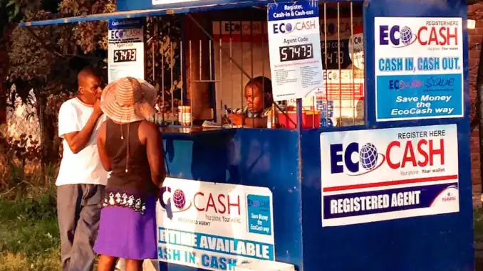
EcoCash offers two primary interfaces: the original USSD (Unstructured Supplementary Service Data) menu system accessible from any basic mobile phone, and the more recent smartphone application. While both serve the same fundamental purpose - enabling users to send money, buy airtime, pay bills, and access other financial services - they deliver notably different user experiences, particularly in how they handle one crucial piece of information: your account balance.
Unlike standard banking apps globally that prominently display your current balance, the EcoCash app hides this essential information by default, requiring users to make a specific (and paid) request to view it. This design choice creates a jarring inconsistency with both user expectations and the service’s own USSD experience, ultimately undermining the very convenience the app promises to deliver. This post goes into why this approach creates a frustrating user experience and deviates from established usability best practices.
Contrasting User Journeys: Checking the Balance
Understanding the user experience requires comparing the two primary methods EcoCash offers:
The USSD Experience
When using EcoCash through its USSD menu, a user dials *151# and navigates through a series of text menus by entering corresponding numbers. The process is functional, widely accessible, if somewhat primitive by today’s graphical standards. Crucially, after completing any transaction - whether sending money, buying airtime, or paying a merchant - the user automatically receives a free SMS confirmation message that includes:
- Transaction details (type, amount, recipient)
- Transaction ID
- The updated account balance
This final piece of information is vital. Without any additional steps or costs, USSD users maintain constant awareness of their financial standing after every interaction with the service.
The App Experience
The EcoCash mobile application presents a more modern, graphical interface with colorful icons and a streamlined navigation system. Users log in through biometrics or a PIN and can quickly access various services through the dashboard. However, something important is conspicuously absent: there is no readily visible account balance anywhere on the main screen upon login. Instead you have the currency followed by asterik (*) placeholders.
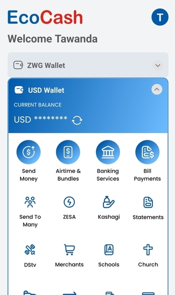
To check their balance, app users must typically:
- Click a button in front of the hidden balance
- Incur a fee for requesting this information
- View the balance (and also get an SMS)
The button to check the balance does not have any confirmation of whether you want to check the balance, nor does it tell you that you will be charged. In fact one way that users notice that they are being charged is that if they keep clicking the button, the balance keeps decreasing.
While users still receive SMS confirmations after transactions (provided the linked SIM is active and has network coverage), there is no immediate, free, in-app display of this critical data before or easily after performing an action. The app functions well as a transaction initiation tool but falls short as a comprehensive financial management interface where balance visibility is concerned.
The Core Discrepancy
This creates a fundamental inconsistency within the EcoCash ecosystem:
- USSD users: Receive free, automatic balance updates via SMS after every transaction.
- App users: Must perform a manual, paid request for balance information, often relying on an external SMS for the result rather than instant in-app feedback.
This discrepancy becomes even more problematic when considering that the smartphone app - theoretically the more advanced and user-friendly interface - actually provides less immediate financial visibility than its USSD counterpart.
UX Analysis: Why This Approach Falls Short
This design choice doesn’t just feel inconvenient; it stands in stark contrast to global standards and violates core usability principles.
1. Deviation from Norms and User Expectations
The EcoCash app’s balance handling is an outlier. Whether examining traditional banking apps (like Standard Bank, ABSA, etc.), established fintech services (PayPal, Wise), neobanks (Revolut), or even competing mobile money platforms (InnBucks), the pattern is overwhelmingly clear: account balances are considered essential information, prominently displayed upon login, and updated automatically (or easily refreshed for free).
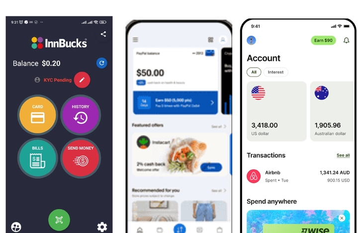 Image collage of various apps showing balance visibility
This global standard sets a strong user expectation. The EcoCash app’s deviation creates cognitive dissonance for users interacting with multiple financial services - they must constantly adjust their expectations and interaction models, adding unnecessary mental load.
2. Violation of Core Usability Principles
Several fundamental usability heuristics are violated:
- Visibility of System Status: Popularized by Jakob Nielsen, this principle states systems should “always keep users informed about what is going on.” In a financial application, the account balance is arguably the most critical status indicator. Hiding it or placing it behind a paywall directly violates this, leaving users uncertain about their financial state within the system.
- User Control and Freedom: Charging for balance inquiries effectively places a toll gate between users and their own financial data. This diminishes user autonomy and creates an artificial barrier to information essential for informed decision-making. Users should have unfettered, free access to understand their own financial position at any time.
- Efficiency and Friction: The multi-step, paid process to check a balance introduces significant friction into what should be one of the most basic and frequent interactions. This inefficiency runs counter to the app’s goal of streamlining financial management.
3. The “App-Only” User’s Dilemma
This UX issue becomes particularly acute for specific user groups who rely solely on the app interface:
- Zimbabwean Diaspora: Maintaining EcoCash accounts but using foreign SIM cards, thus not receiving the balance SMS reliably.
- Users with Lost/Damaged SIMs: Able to access the app via Wi-Fi but unable to receive SMS confirmations.
- Users in Poor Network Areas: Having internet access (Wi-Fi) but unreliable mobile network coverage for SMS.
These app-only users face a compounded challenge: they are entirely dependent on the paid in-app balance inquiry feature, effectively creating a class of users penalized for their circumstances.
4. Impact on Trust & Transparency
Financial services hinge on user trust. By placing essential balance information behind a paywall, EcoCash inadvertently sends a troubling message that transparency might come at a price. This practice can be perceived as “nickel-and-diming” and runs counter to the trust-building transparency prioritized by most successful financial services.
The Ripple Effect: User Impact and Consequences
The consequences of this design decision extend far beyond simple inconvenience, creating tangible negative impacts:
- Increased Cognitive Load: Users must mentally track their approximate account status, increasing mental effort and the likelihood of miscalculation.
- Potential for Transaction Errors: Uncertainty about funds increases the risk of failed transactions due to insufficient balance, causing frustration and potential real-world problems.
- Financial Anxiety and Hesitation: Not knowing one’s exact balance can breed anxiety, causing users to hesitate before making necessary transactions.
- Accumulation of Micro-Costs: Individual fees accumulate, penalizing users for attempting to be financially aware and responsible.
- General User Frustration: The combined effect damages the overall app experience and brand perception, potentially driving users back to USSD or towards alternatives.
Recommendations for Improvement
Addressing this UX flaw involves adopting standard, user-centric practices:
- Recommendation 1: Display Balance Freely on Dashboard: The most crucial change. Show the current account balance clearly and prominently on the app’s main dashboard immediately after login.
- Recommendation 2: Implement Free In-App Balance Refresh: Include a simple, free mechanism (e.g., a pull-to-refresh gesture or a dedicated refresh button) allowing users to update their balance information within the app at any time.
- Recommendation 3: Provide Immediate In-App Confirmations: While SMS confirmations are useful records, the app must also display transaction confirmations with the updated balance directly within the interface immediately after a transaction is completed.
Benefits of Implementation:
These changes, relatively straightforward from a technical perspective, would yield significant benefits:
- Improved User Satisfaction: Aligning with user expectations and reducing frustration.
- Enhanced Transparency & Trust: Removing barriers to essential information builds user confidence.
- Reduced Friction: Streamlining common user tasks and improving efficiency.
- Greater Inclusivity: Providing a better experience for all users, especially app-only segments.
- Strengthened Competitive Positioning: Aligning the app with modern fintech standards.
Conclusion: Prioritizing User-Centricity
EcoCash has undeniably revolutionized financial access in Zimbabwe. However, its mobile application’s current approach to balance visibility represents a significant UX shortcoming that undermines its potential. By hiding essential financial information and charging for access, the app creates unnecessary friction, deviates from global best practices, and risks eroding user trust.
Adopting the straightforward recommendations outlined above - displaying the balance freely, allowing easy refreshes, and providing immediate in-app confirmations - would dramatically improve the user experience. As financial technology continues to evolve, user-centric design choices like these are not just niceties; they are fundamental to maintaining relevance and user loyalty.
For EcoCash to fully deliver on its promise of convenient, accessible financial services via its app, it must recognize that transparency regarding a user’s own balance shouldn’t be a premium feature, but a standard, freely accessible right. In the realm of digital finance, knowing where you stand shouldn’t come at an extra cost.
(What are your experiences checking balances on mobile money apps in Zimbabwe or elsewhere? Share your thoughts!)
Disclaimer: This analysis is based on publicly described user experiences and standard usability principles as of April 2025. Features and interfaces may change with future updates. The author is not affiliated with EcoCash or its parent company.